Bake & Brew

Role
Time
Tool
Project Context
Background
Bake & Brew is a shopping app for Bakery which located in the suburbs of a metropolitan area. This bakery focus to attract and retain customers to order online. It is very noticeable that they introduce a dedicated mobile apps which offers multiple deals and daily rewards including broad spectrum of healthy and delicious bakery menu. The target customers for this bakery like who are really looking for healthy bakery food with good price.
Healthy diet followers who have lack of the time to prepare or find a healthy meal or bakery food.
Goal
The goal of this project is to design an app for Bake & Brew bakery that allows users to easily order and pick up fresh, healthy bakery food.
User Research
I conducted interviews and created empathy maps to understand the users I’m designing for and their needs. A primary user group identified through research was working adults who don’t have time to prepare or find healthy meals and bakery food. This user group confirmed initial assumptions about Bake & Brew customers, but research also revealed that time was not the only factor limiting users from cooking at home. Other user problems included obligations, interests, or challenges that make it difficult to find a healthy bakery in-person
Building Empathy
We established a persona profile using the quantitative and qualitative information from the survey and interview responses.
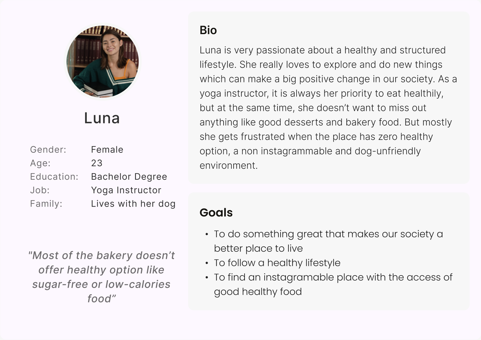
Mapping Luna’s user journey revealed how helpful it would be for users to have access to a dedicated Bake & Brew app.

Affinity Diagram
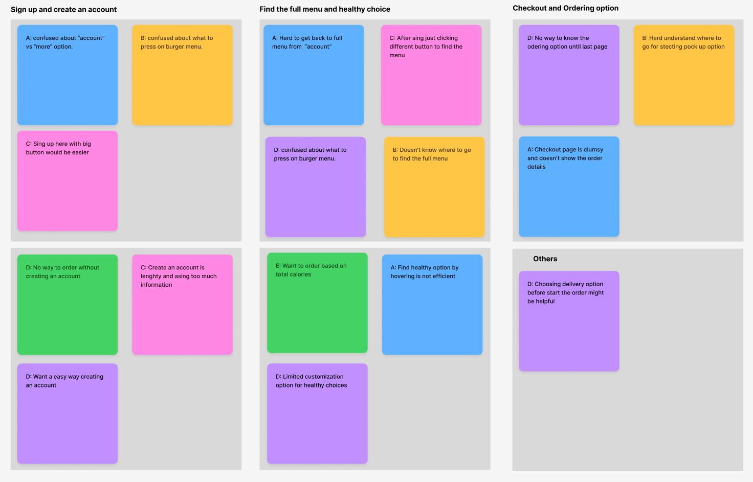
At this point, I have a thorough and organized spreadsheet full of notes and observations from the testing I did on Bake & Brew Lo-fi prototype. Then I started adding those observations to digital sticky notes to make an affinity diagram.
Ideation
Sketches
Taking the time to draft iterations of each screen of the app on paper ensured that the elements that made it to digital wireframes would be well-suited to address user pain points. For the home screen, I prioritized a quick and easy ordering process to help users save time

Brainstorming
In the ideation process we were developing, and refining ideas to address the user's needs and create an effective and delightful user experience that solves our users problem more effectively. Designing a new and innovative solution required us to brainstorm not only the design but how we would introduce this new flow to users. We explored different solutions and sketched out the user flows. Then we discussed and decided the most feasible solution for our users
1. Based on the type of plant and geographical location, we will suggest a plant care schedule. Users will receive a message when it is time to buy pest control, fertilizer, or a bigger pot
2. The user will receive notifications when it is time to care for their plants, and they have to check off that they completed the task
3. For existing plant and pet owners, they can input the pets and plants they have. If there are any conflicts, they will receive a pet warning which plants are dangerous.
Digital Wireframes
As the initial design phase continued, I made sure to base screen designs on feedback and findings from the user research. Using the completed set of digital wireframes, I created a low-fidelity prototype. The primary user flow I connected was building and ordering food quickly, so the prototype could be used in a usability study.

I conducted two rounds of usability studies. Findings from the first study helped guide the designs from wireframes to mockups. The second study used a high-fidelity prototype and revealed what aspects of the mockups needed refining. Here are all the findings I got from usability studies:
1. Users want an easy food ordering process.
2. Users want a delivery option before start the order.
3. Users want quick customization options.
4. Add a “order as a guest” option help users to order quickly without creating a profile.
5.The checkout process doesn't have add items option
Final Design
The usability studies revealed that the users expressed a desire to easy signup option or ordering as a guest, also added customize it with more customize option and lastly during checkout put a button for add more items. So these are 3 key mockups:

High-fidelity Prototype
The final high-fidelity prototype presented cleaner user flows for ordering food and checkout. It also met user needs for a pickup or delivery option as well as more customization

Reflection
Impact
The app makes users feel like Bake & Brew really thinks about how to meet their needs. One quote from peer feedback:
“The app made it so easy to order bakery food ! I would definitely use this app as a go-to for a delicious, fast, and even healthy food.”
What I learned
While designing the Bake & Brew app, I learned that the first ideas for the app are only the beginning of the process. Usability studies and peer feedback influenced each iteration of the app’s designs.
Miami, FL
ausmita.barman@gmail.com